The challenge
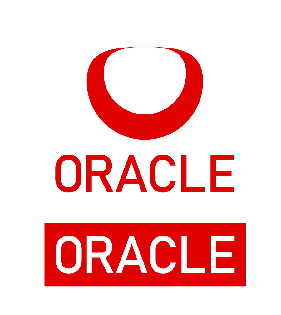
Oracle founded in 1977 has experienced vast growth and innovation in the software market. The logo has fallen behind the times and no longer captures the essence of the forward thinking tech giant.
The solution
The new logo is inspired by the original "O" Oracle logo. The redesign takes on a new shape and orientation as the company has grown significantly since 1977. The company is more dynamic and unique, which necessitates a design that signifies that. This "O" logo is turned 90 degrees and stretches towards the horizon line and into the future.
The logo visually occupies present and future a reference to the prophetic powers of the Oracle of Delphi. In the new font the letters "O" and "C" repeat that turn reinforcing a forward looking orientation befitting a forward looking innovation provider.